Rebuilding Knowledge Platform's LMS
Role Product Design Lead · Timeframe 2022–2023
Knowledge Platform's LMS was working but not scaling — students took five clicks and twenty seconds to reach a lesson, and principals couldn't act on dashboards dense with twenty-plus KPIs.
Over six months I ran a GSMA-supported research sprint with 41 participants, then led the rebuild: one product with two deployments, a new content model, and dashboards aligned to how schools already grade students.
Time-to-lesson dropped to two clicks. The product broke even in launch year — a first — and schools brought the dashboards into renewal conversations.
Context
Knowledge Platform is a Pakistan-headquartered EdTech company that has spent over a decade building learning products for schools across Pakistan, the UK, and Afghanistan. Its core product is a Learning Management System, deployed two ways: on-premise at the school level (working offline without internet) and as a public online product for individual learners. Internally these were called LSC and LSP. Externally they were two brands, two URLs, and two stories — running on the same content library and quietly hitting the same problems.
I joined as the company’s first dedicated product designer. The team was engineering-heavy and shipped fast. The product surface had grown by accretion over years, with features layered on top of features. By the time I came on, the LMS was doing what it had been built to do — but it was getting harder for students to use, harder for the sales team to sell, and more expensive to onboard each new school. This case study covers the six-month redesign I led that turned that around.
I worked directly with the CEO and CTO. I owned the design and the design-side roadmap, prioritization, engineering handoff, release communications, and cross-functional alignment with sales, BD, and outreach. The redesign shipped in Pakistan, the UK, and Afghanistan, and broke even in launch year — a first for the product.
The Problem
The clearest diagnostic was this: it took five clicks and fifteen to twenty seconds for a student to navigate from sign-in to a lesson listing view — and then at least another ten seconds for the lesson video itself to load on a typical school connection. Close to half a minute before a student could actually begin learning, on a path they were meant to run multiple times a day. It punished the exact behavior we wanted to encourage.
But the speed problem wasn’t the deepest one. The deeper problem was on the school side. The dashboards we showed principals and teachers were dense with KPIs — twenty-plus metrics covering item-level accuracy, engagement trends, usage stats, and more — and very few of them mapped to how schools actually graded students. Principals couldn’t use the dashboards to make decisions. Sales and BD had compensated by spending weeks per school, on the ground, walking principals through what each metric meant and how it tied back to the school’s own reporting. It worked, but it didn’t scale. Every new school we signed meant another multi-week onboarding effort. The product was getting more expensive to sell, not less.
A few other patterns kept surfacing in support tickets and account reviews. Students described the classes page as overwhelming with no clear path through the information. Lesson content sat several layers deep, behind subject and topic hierarchies that were hard to search. And the customer support backlog meant users learned to give up rather than escalate.
“I feel like I have entered a maze. It is confusing.” — Student, GSMA sprint FGD
The product was working. It just wasn’t scaling.
The Research
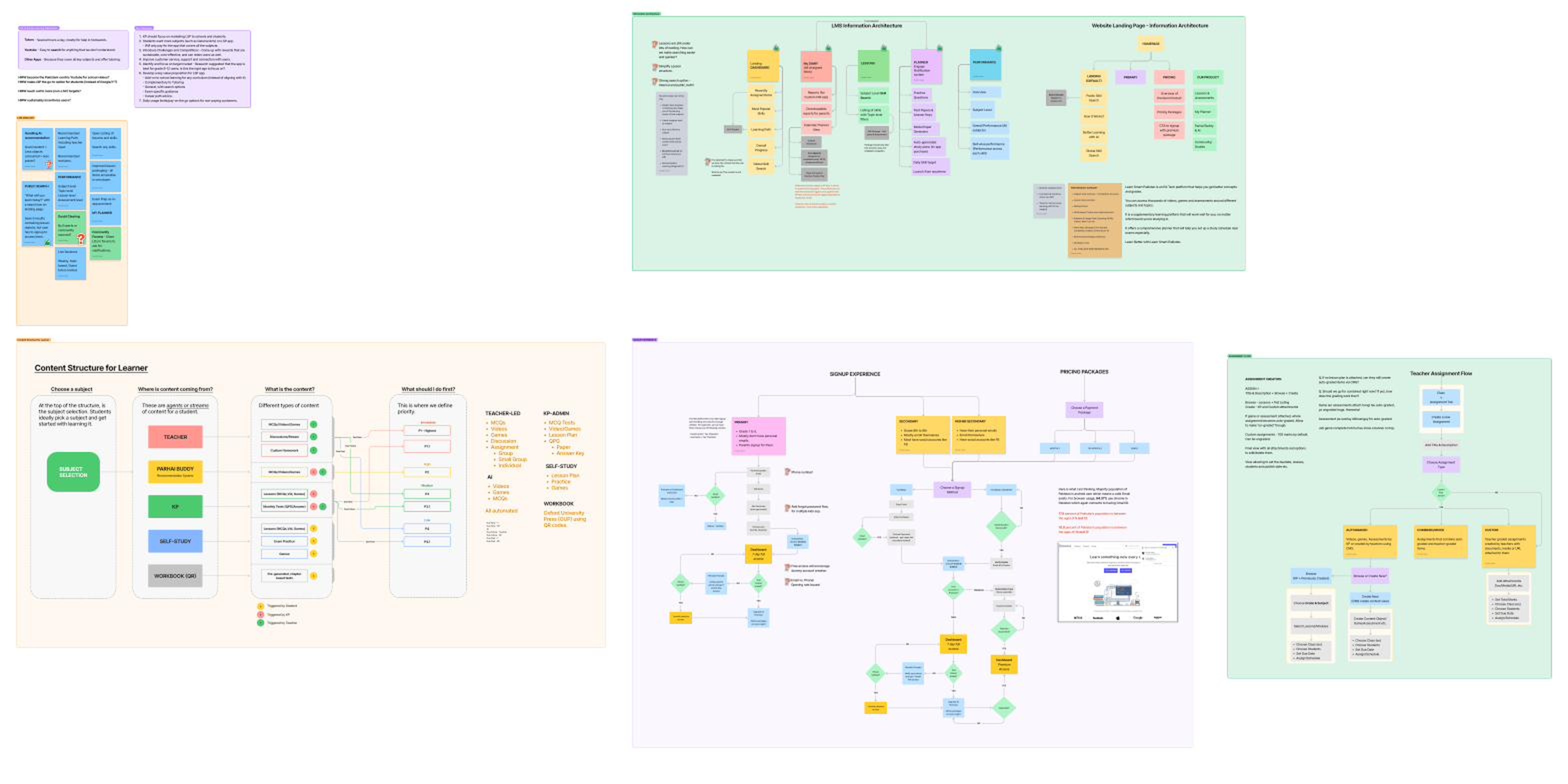
I wanted a redesign mandate, and I wanted the redesign to be defensible — internally, and to the schools we’d later ask to migrate. The right way to do both was to ground the case in primary research with real users. A GSMA-supported design sprint became the vehicle for that.
Working with the GSMA facilitation team, we ran the full ten-day sprint structure: an alignment workshop, two days of field research, an ideation workshop, two more days of field testing, and a recommendations day. I helped shape the research plan and participated from kickoff through synthesis.
We spoke to forty-one people across two parallel teams — an Islamabad-based field team conducting in-person school visits, and a remote team running online interviews. The split:
- 4 FGDs with school students (29 participants total)
- 6 one-on-one interviews with individual public-product users
- 4 one-on-one interviews with school principals
- 2 interviews with parents
One change I pushed for was in how we asked questions. The original guides leaned on rating-scale prompts — “on a scale of one to ten, how much do you like X” — which tend to surface confirmation rather than insight. We rewrote them around open-ended, non-leading questions: “How do you feel about this? Tell me what you do when this happens. What would you do differently?” The change in question structure pulled out a different quality of answer. Most of the sprint’s most useful insights came from those reframed prompts.
Six findings came out of synthesis:
- The buyer wasn’t the parent. It was the school and the student. Parents didn’t drive sign-ups — teachers and principals did. This contradicted a long-held assumption.
- Students wanted broader subject coverage. We were science-heavy; arts students were going elsewhere.
- Competition and reward mechanics — leaderboards, streaks, lightweight game economies — were visibly motivating in the products students said they preferred.
- Customer service was a trust problem, not just a queue problem.
- The strongest engagement sat in grades 9–12. That was where focus needed to be.
- The product needed a sharper, stateable value proposition.
“Online learning is better than tuition. Tuitions are not rewarding all the time.” — School Principal, GSMA sprint interview
From those findings we built a set of How-Might-We prompts, and from the HMWs we sketched out the first cut of modules for the redesigned product.
We took those findings back to leadership with a clear pitch: this was the case for a real redesign, with measurable cost and adoption upside on the other side. The pitch landed, and the six-month rebuild started.
The Process
The redesign had two layers. The first was structural — information architecture, content model, navigation. The second was experiential — signup, dashboard, lesson launch, performance, and the teacher’s assignment flow.
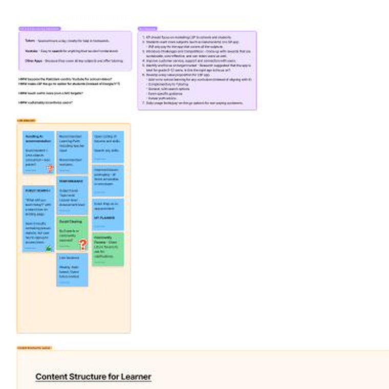
On structure. The old IA had grown by accretion — lessons under topics under subjects under classes, with parallel hierarchies for assigned work, custom homework, and exam practice. We collapsed it into five top-level modules: Dashboard, Lessons, My Diary, Performance, and Planner. A global skill search sat above the whole thing so students could break out of hierarchy when they already knew what they wanted.
The content model was the more important structural change. Every piece of content in the system — regardless of whether a teacher assigned it, the platform recommended it, or the student found it on their own — got tagged with three things: its source (Teacher, KP-curated, the Recommendation System, Self-Study, or Workbook QR), its type (video, game, MCQ, assessment, lesson plan), and a priority (P1 Due Now through P4 Due Past, weighted by source). The priority engine meant that when a student opened the app, the system already knew what to surface first. We weren’t asking students to do triage anymore — we were doing it for them.
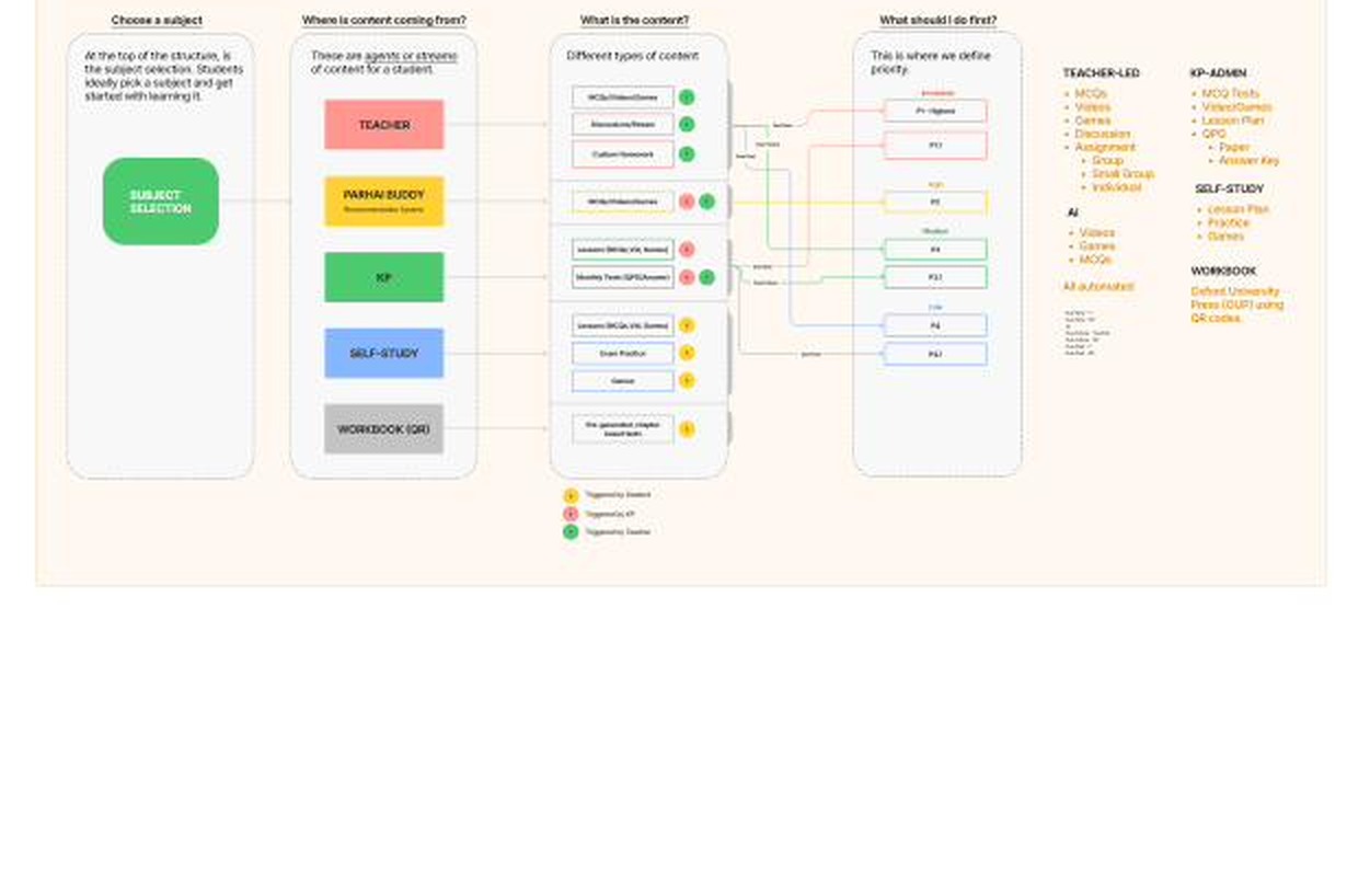
On experience. Signup got rebuilt into three age-tiered flows. Primary-school children sign up with parent email plus a favorite-character selector. Secondary students use social logins. Higher-secondary students self-onboard with email and password. Each tier matched the reality of how that age group actually has and manages accounts in Pakistan.
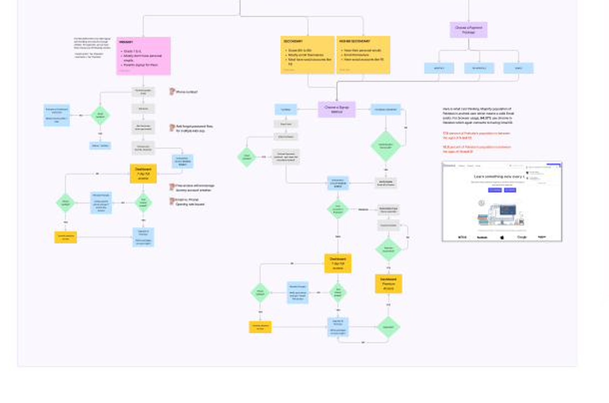
The teacher’s assignment flow, which had been a single ambiguous “create assignment” path, became three explicit ones: Autograded (built from KP content or teacher-created CMS items), Custom (teacher-graded, with file or URL attachments), and Combined. The flow tells the teacher which type they’re building and adjusts grading defaults accordingly — no more accidental ungraded assignments or unclear scoring.
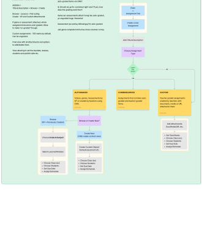
The performance dashboard got the deepest rework, and that’s where most of the discussion concentrated.
Key Decisions
Five decisions defined the redesign.
1. We pared the KPI surface back to what schools actually grade against.
This was the hardest internal call. The sales and BD teams had real, well-founded concerns. They had spent years walking schools through the full KPI suite, and the long-form metrics were genuinely part of how they had sold the product. Cutting them felt like throwing away years of customer education.
The argument that landed wasn’t about design preference. It was about unit economics. Every additional KPI on the dashboard was another item we had to explain school-by-school, in person, for weeks. The cost scaled linearly with new accounts. If we wanted to grow into the next thousand schools without growing onboarding cost in lockstep, the dashboard needed to be self-evident. The principle was simple: a product that needs explaining is a product that costs money every time you sell it.
We kept the metrics that mapped to how schools were already reporting on students — subject and lesson completion, accuracy, attempt scores, weekly and term trends, work stats, skill-level proficiency, and a clear report card view — and put the rest behind drill-downs for the schools that wanted them.
🖼 Figma screen placeholder: new performance dashboard — KPI summary card view, with the school-aligned metrics surfaced and the rest behind drill-downs.
2. One product, two deployments.
The LSC/LSP split was confusing internally and to customers. They were never two products. They were one product, deployed two ways: offline at the school level (where the deployment ran on local infrastructure and didn’t need the internet) and online for public access. We collapsed the brands, renamed the product to KP LMS (later “Coach”), and treated online and offline as deployment modes of a single product. One IA, one design system, one feedback loop, one roadmap.
3. We designed against time-to-first-lesson.
I picked one diagnostic metric and let it drive the dashboard, navigation, and lesson player. From sign-in to a lesson listing: five clicks down to two, and fifteen-to-twenty seconds down to a handful. The lesson video itself, which had taken at least another ten seconds to load on a typical school connection, came down meaningfully on top of that. Everything that didn’t earn its place on that path moved off it. The dashboard now surfaces “continue where you left off” and the next P1 item as the first two interactions — most students never need to navigate further.
🖼 Figma screen placeholder: new learner dashboard — “continue where you left off” plus next-priority surface as the first two visible elements.
4. Replaced a complex recommendation system with one that matched how students actually learn.
The old recommender ran on a cross-grade, cross-subject knowledge graph. To activate it, students took a 20-question diagnostic test, after which the system surfaced lessons it thought addressed their weakest skills. The output was often wrong — 20 questions can’t cover all the learning objectives in a grade’s worth of coursework, so the model was guessing at gaps it hadn’t measured. And recommendations couldn’t be skipped or corrected, which meant a student who already knew the recommended lesson had to sit through it.
The first fix was small: a skip-with-feedback control. Students could dismiss a recommendation and tell the system why — I already know this, this isn’t relevant, this is too hard. That gave the model the signal it had been missing.
The bigger fix came when I looked harder at how the model was actually working. Even when accurate, it would route a grade-9 student struggling with vectors in physics back to a grade-8 mathematics lesson on vectors. Technically correct, practically useless. Students at school consume content linearly — topic after topic within a subject within a grade — and jumping across grades and subjects didn’t match how they studied at school or at home.
We replaced the knowledge graph with a rule-based system in two flavors. Linear progression — the next lesson in each subject (or in each topic within each subject), updated as the student completes them. Weak-skill targeting — skills the student has attempted and scored below threshold in, typically 50%.
The principle: sometimes the right call is to give up a sophisticated model for a simpler one that actually matches the world.
5. The system answers “what should I do first?”
Most LMSes show students a list and let them sort. The priority engine I described earlier means the system can answer the question every student asks first thing in the morning — what’s due, what’s recent, what should I do now? — without making them figure it out. This was a content-model decision dressed up as a UX decision.
“I am stuck on a concept I learned at school. I didn’t understand it well and need more clarity.” — Student, GSMA sprint FGD
When the student opens the app to clear a concept they didn’t get in class that day, the system shouldn’t make them go hunting. The priority engine, combined with global skill search and the “continue where you left off” surface, was the answer to that.
6. I cut the personal study planner I wanted to ship.
I wanted a learner-side timetable and study planner in the first release. The stakeholder consensus was that the rebuild was already a large change for schools to absorb, and adding a major new behavior on top would risk the broader adoption story. I disagreed with the call but understood the reasoning, and we shipped without it. With hindsight, the cautious launch was right for the school side, but I think the planner would have been the right thing to add in v1.1, and we lost momentum by deferring it longer than we needed to.
Outcome
The redesign shipped across Pakistan, the UK, and Afghanistan.
By the numbers
⏱ Time to a lesson: 15–20 seconds and 5 clicks → a handful of seconds and 2 clicks. Lesson load on top of that came down meaningfully.
📈 Break-even in launch year. A first for the LMS at K.P.
🏫 Principals adopted the new dashboards as a primary student-performance-tracking tool — schools started bringing the dashboards into renewal conversations rather than the other way around.
🌍 Shipped in three markets: Pakistan, UK, Afghanistan.
💼 Per-school onboarding cost dropped. Sales spent less time in the field walking through metrics that didn’t need walking through.
The numbers that matter, in more detail:
- Time to reach a lesson dropped from fifteen-to-twenty seconds and five clicks down to a handful of seconds and two clicks — on a path the new dashboard surfaces by default. The lesson video, which had previously taken at least another ten seconds to load on a typical school connection, came down meaningfully on top of that. The combined effect was that a student could start learning in a fraction of the time the old product allowed.
- The product broke even in launch year. A first for the LMS at K.P. The combined effect of faster school onboarding, better retention, and improved conversion on the public deployment made the unit economics work.
- Principals adopted the new dashboards as a primary performance-tracking tool. This was the outcome I cared most about. The old dashboards were a curiosity. The new ones became part of how schools ran their weekly student-performance reviews. Sales and BD reported back that renewal and adoption conversations changed shape — schools were bringing the dashboards into the conversation rather than the other way around.
- Operational onboarding cost per school dropped. Sales spent less time in the field walking through metrics that didn’t need walking through, and could move on to the next account faster.
The redesign also became the foundation for the rest of the product surface. The Offline LMS, the Stakeholder Dashboards, the Exam Prep delivery model (the same LMS packaged around exam-focused content for specific schools and learner segments), and the Assignments & Rubrics system all sit on top of the IA, content model, and design system we built in this rebuild. Each became its own product stream after this one shipped, and each is a nested case study in this portfolio.
Reflection
The most useful lesson from this project wasn’t a design lesson. It was about how research, framed correctly, can change what an organization is willing to invest in. The GSMA sprint produced six insights. The more valuable thing it produced was a shared diagnosis — between design, engineering, sales, and leadership — of what was actually broken and what would change if we fixed it. Once that diagnosis was shared, the redesign stopped being something design was advocating for and became something the company was building together.
A good product is one that doesn’t require explaining. That principle resolved the hardest internal argument on this project, and I’ve used it as a tiebreaker in every product decision I’ve made since.
A few other principles I carry into every product role since:
- The system should answer the user’s first question, not present them with the options to find it themselves. The priority engine did this for students. The consolidated dashboard did it for principals.
- Don’t make institutional buyers learn your metrics. Adopt theirs. Schools adopted the new dashboard because we kept what they were already reporting against.
- One product, multiple deployments — almost always. Splitting one product into two brands tends to multiply work without multiplying value.
- Question design is research design. Shifting from rating-scale prompts to open-ended, non-leading ones changed the quality of what we learned in the sprint. I’ve been deliberate about how I structure research questions ever since.
The thing I’d do differently: I’d have pushed harder for the personal study planner in v1.1 rather than deferring it further. The cautious initial launch was right for schools. The follow-through on the learner side could have been sharper.
The rest of this portfolio nests inside this project. Each product I’ll walk through next is a continuation of what we set up here.
Role: Product Design Lead — led design, design-side roadmap, prioritization, engineering handoff, and cross-functional communications, reporting to the CEO and CTO • Duration: 6 months for core redesign • Cross-functional partners: in-house engineering, sales, BD, and outreach teams • External partner: GSMA design sprint facilitators • Markets: Pakistan, UK, Afghanistan
Still in flight — what would lift this case study further
- Figma frame exports. Three to five clean screen captures: the new learner dashboard, a signup screen showing the age-tiered flow, the lesson player, the new performance dashboard, and the teacher’s assignment-creation flow. Placeholders are marked inline above where each one should sit.
- A short post-launch principal quote on adopting the new dashboard as a primary performance-tracking tool. Slots into the Outcome section to ground the dashboard-adoption claim.
- A short sales/BD partner quote on per-school onboarding time before and after the redesign. Slots into Decision #1 to ground the unit-economics argument.
- Firm school counts. Live schools across Pakistan, the UK, and Afghanistan at launch and at the 12-month mark.
- Exact KPI count, before and after. Currently described as “twenty-plus → a core set.” A specific count on each side would tighten the claim.